Crafting Impact: Choosing the Right Color Scheme for Your Website
One of the most underestimated yet powerful elements of web design is color. As designers, we know that choosing the right color palette isn’t just about aesthetics—it’s about communication. Color carries emotion, influences behavior, and shapes perception. That’s why selecting the right hues for a website isn’t just a creative decision; it’s a strategic one.
Ever paused while designing a website for a luxury brand and questioned if black conveys enough sophistication? Or wondered what shade of red truly stimulates appetite for a food-based business? You’re not alone. These decisions can make or break a brand’s digital experience.
The Psychology Behind Color Choices
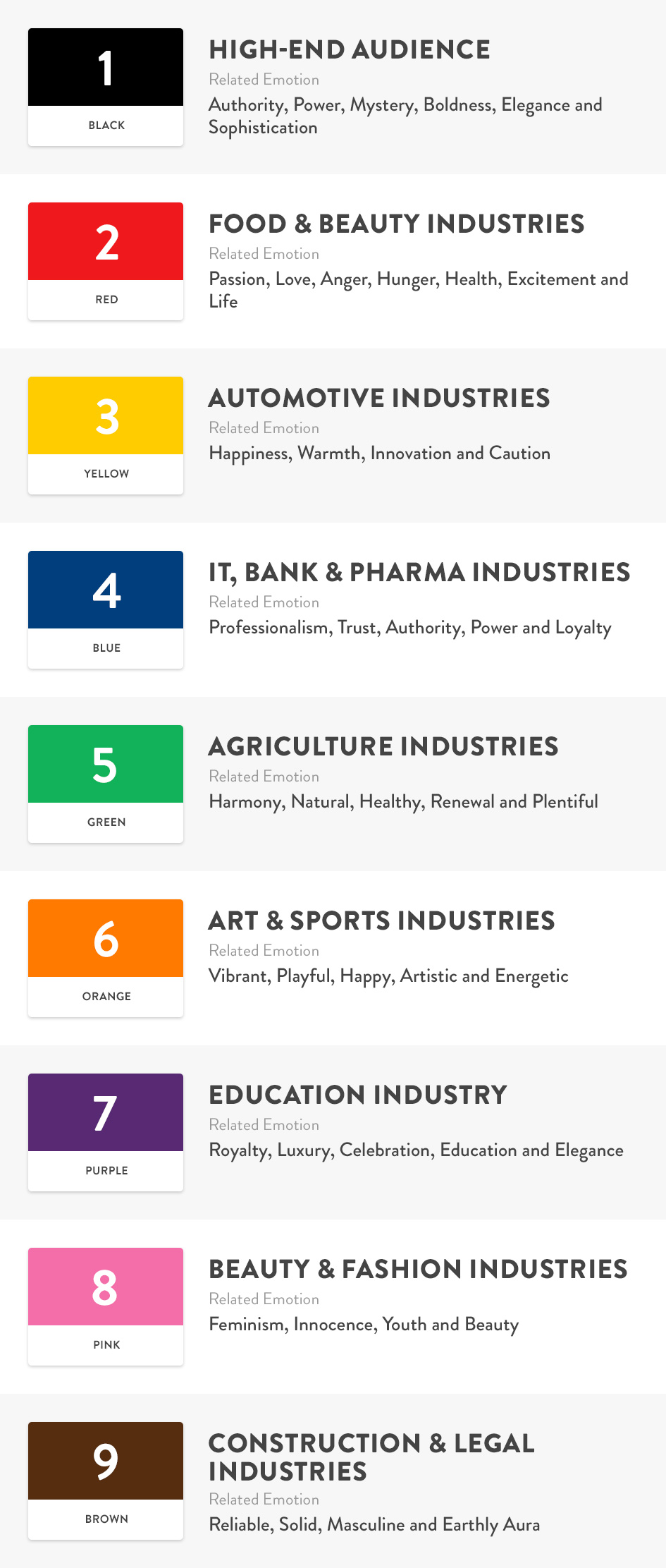
Each industry taps into a different set of user emotions. The secret lies in understanding what your audience should feel when they visit the website. Do you want them to feel trust? Excitement? Sophistication? Your color palette should guide them there—effortlessly.
For example:
- Black speaks to a high-end audience, exuding power, mystery, and elegance.
- Red drives action and appetite—ideal for food and beauty industries.
- Blue builds trust and professionalism, making it a natural choice for IT, banks, and pharmaceuticals.
- Green connects to nature, health, and renewal—perfect for agriculture-related sites.
I’ve created a reference visual to help decode the emotional impact of color across different industries. This guide is a great starting point when building color schemes that align with your client’s brand essence and target market.
Design with Intention, Not Assumption
While inspiration can come from mood and intuition (we all have those “yellow-only” days), design choices should be rooted in psychology and purpose. When in doubt, ask yourself:
“What should the user feel when they land on this site?”
“Does this color combination create a memorable connection?”
A well-thought-out color strategy can create instant bonding between a brand and its audience. And when color is chosen with clarity, intention, and understanding—it stops being just “design” and becomes experience.
Conclusion
Color isn’t just a visual element—it’s an emotional one. The more we study it, the more we realize how much it shapes perception. Let your next project speak louder through colors that truly reflect the business’s identity. Trust the psychology. Trust the strategy. And above all, trust your eye.
Would love to hear your thoughts—what color do you gravitate toward when designing?