Intensified Fonts to Replace Helvetica
Helvetica is arguably the most beloved typeface of all time. But its overuse has made it a rather mundane option for many creative designers today. If you’re looking for an exciting yet familiar alternative, this article is for you.
The Story Behind Helvetica
Born in 1957 from the mind of Swiss typeface designer Max Miedinger, Helvetica was inspired by the 19th-century typeface Akzidenz-Grotesk and many other German and Swiss modernists. Originally named Neue Haas Grotesk, it was designed to be a neutral, highly legible sans-serif that could rival Akzidenz Grotesk and suit a wide variety of design applications.
After the Haas Type Foundry joined the Linotype group, the name was changed to Helvetica, a nod to “Helvetia”—the Latin name for Switzerland. With its clean lines and balanced structure, Helvetica became a pillar of the International Typographic Style and the most iconic typeface of the 20th century.
One of its most distinctive features is the termination of all strokes on horizontal or vertical lines, combined with tight letter spacing—giving it a dense, compact, and highly readable appearance.
Looking Beyond Helvetica
As timeless as it is, designers today are craving something a little different—something that nods to Helvetica’s legacy without being quite so… expected. If you’re one of them, here’s a list of amazing alternatives to experiment with:
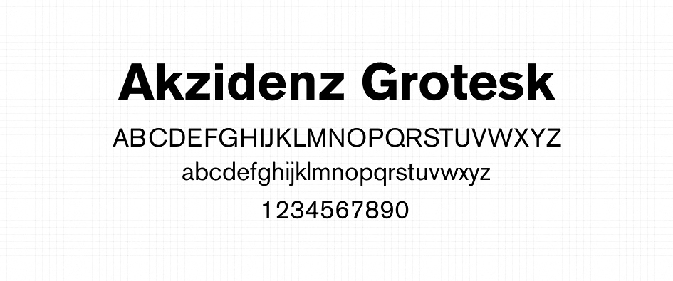
- Akzidenz Grotesk – The original source of inspiration for Helvetica. Slightly more humanist in feel.
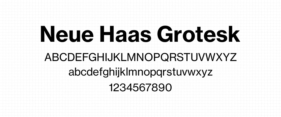
- Neue Haas Grotesk – Helvetica’s predecessor. More refined and truer to Miedinger’s vision.
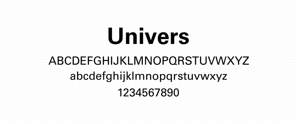
- Univers – A modular type system designed by Adrian Frutiger with great versatility.
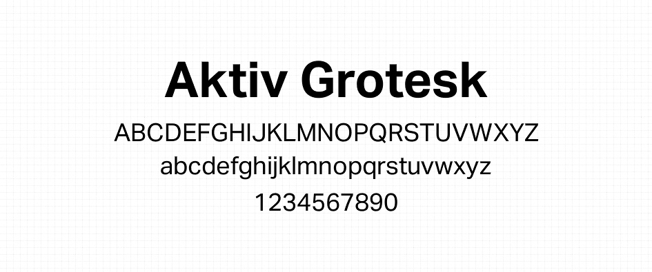
- Aktiv Grotesk – Clean and modern, designed to be the “Helvetica killer.”
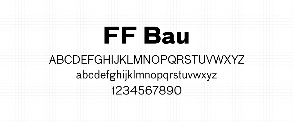
- FF Bau – A robust typeface rooted in early grotesques, with a more architectural feel.
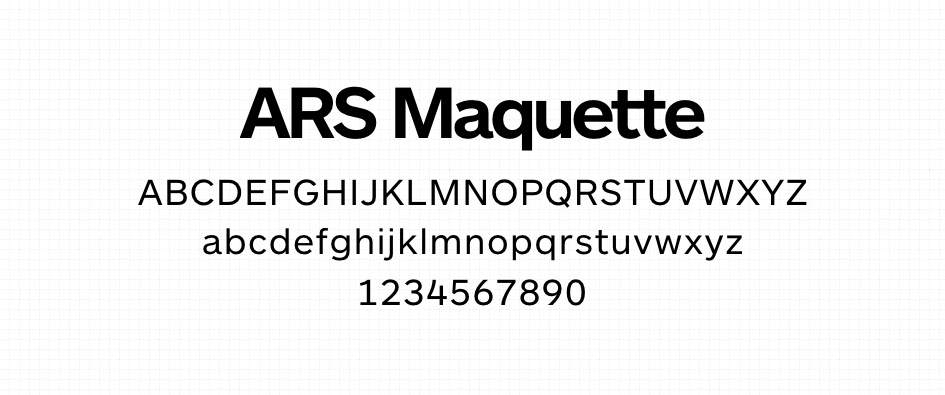
- ARS Maquette – A geometric and functional sans serif with a modern twist.
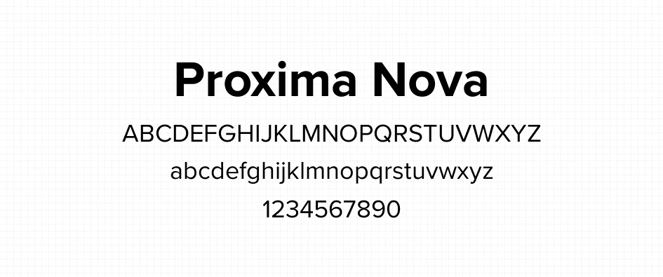
- Proxima Nova – Blends modern proportions with geometric aesthetics—great for digital platforms.
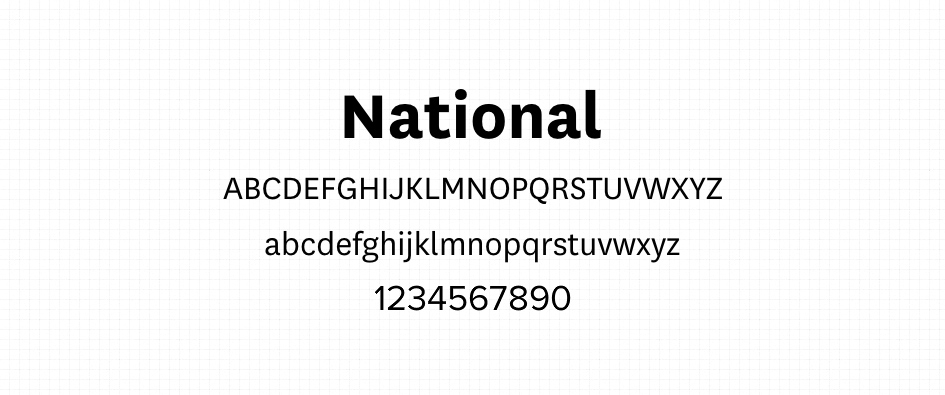
- National – A warm, versatile typeface with a sense of neutrality and clarity.
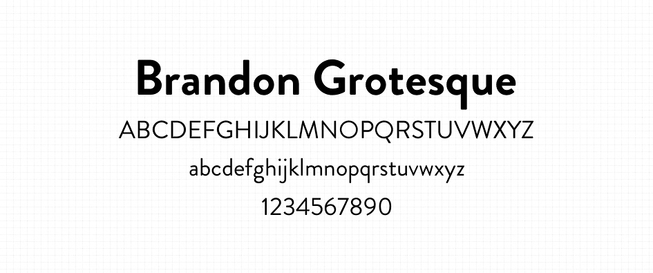
- Brandon Grotesque – Stylish and geometric with rounded corners—more character, less stiffness.
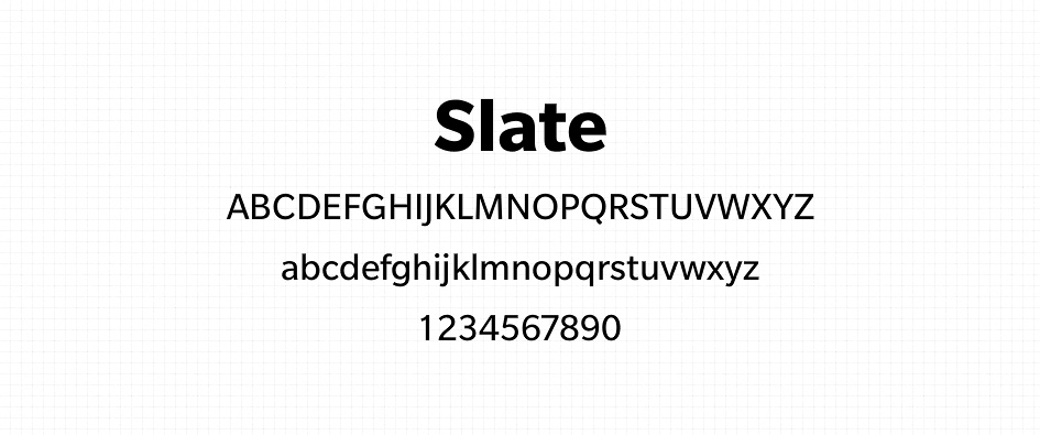
- Slate – Designed for optimal screen readability with a clean and sophisticated edge.
Conclusion
Helvetica will always have a place in design history, but sometimes stepping outside the box can lead to more distinctive, meaningful work. These fonts offer similar neutrality and clarity—but with more personality, flexibility, and modern usability.
Ready to try something new? Bookmark these options, and elevate your typography game by experimenting with these fresh Helvetica alternatives.