Pantone Colors 101: A Beginner’s Guide for Designers
When you step into the world of design, one term you’ll hear again and again is “Pantone.” But what exactly is a Pantone color, and why is it so important for designers?
If you’re new to design or just curious, don’t worry — this guide will break it all down for you in the simplest way possible.
What Is Pantone?
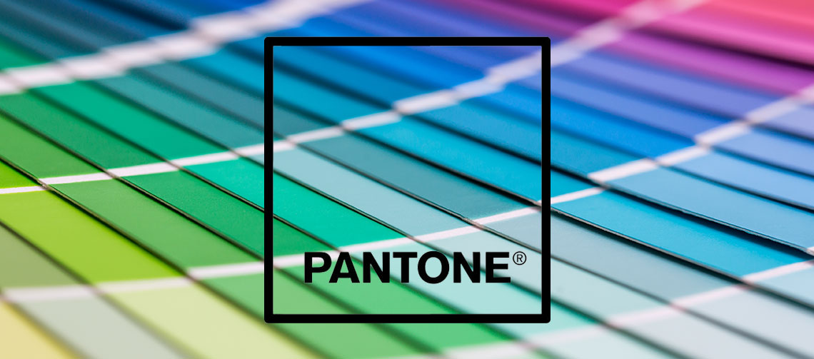
Pantone refers to a standardized color matching system. Think of it as a universal color language used by designers, manufacturers, and printers around the world to make sure colors look exactly the same — no matter where or how they’re produced.
Pantone is actually the name of the company that created this system. Their “Pantone Matching System” (PMS) ensures that if you pick a color from their system, anyone anywhere can replicate it precisely.
Why Is Pantone Important for Designers?
When you create a design on your computer, it might look one way on your screen, but a printer or manufacturer might see it slightly differently. Different screens, printers, inks, and materials can change how colors appear.
Pantone helps solve this problem.
By choosing a Pantone color, you’re choosing a color that has a specific, standardized recipe — making it super clear what you expect, without relying on screens or guessing.
👉 For example, if you tell a printer “use Pantone 186 C,” they know exactly which red you’re talking about — no surprises!
Where Are Pantone Colors Used?
You’ll find Pantone colors in a lot of places, such as:
-
Logos and branding (to ensure consistency across products)
-
Packaging design
-
Fashion and textiles
-
Interior design
-
Product manufacturing
-
Web and digital designs (inspired but converted to screen-friendly formats)
Anywhere that color accuracy matters, Pantone steps in.
How Does the Pantone System Work?
Pantone colors are identified by numbers and letters.
Example: Pantone 300 C.
-
The number represents the specific color.
-
The letter indicates the material:
-
C stands for Coated (like glossy paper)
-
U stands for Uncoated (like matte paper)
-
M for Matte
Each version slightly adjusts how the color appears on different surfaces.
-
Pantone releases color books (called swatch books) where you can see the colors printed on paper — no screen needed!
Is Pantone Only for Print?
Pantone is mostly known for print and physical materials, but in today’s digital world, its influence goes beyond that.
Designers often start with a Pantone color, then find its closest digital equivalent in RGB or HEX codes for use on websites and apps.
Fun Fact: Pantone even picks a “Color of the Year” every year that influences fashion, interior design, and marketing trends!
How Do You Use Pantone Colors as a Beginner Designer?
If you’re just starting out:
-
Get familiar with Pantone swatch books (they’re pricey but very useful).
-
In design software (like Adobe Illustrator or Photoshop), you can access Pantone color libraries.
-
Always check with your printer or manufacturer if they require Pantone specifications.
-
Use Pantone to create consistent branding and professional-grade designs.
Quick Tips for Beginners
- Don’t mix Pantone with CMYK randomly. They are different printing systems. Use Pantone when color precision is critical.
- Communicate clearly. Always mention the full Pantone name (like “Pantone 1375 C”) in your design briefs.
- Stay updated. Pantone releases new colors and trends — keep an eye on them to stay modern.
Final Thoughts
Pantone might seem technical at first, but it’s truly a designer’s best friend. It ensures that your vision is communicated clearly and consistently — no matter where your designs go.
As you grow as a designer, understanding Pantone will become second nature.
Start simple, experiment with colors, and don’t be afraid to refer back to this guide anytime you need a refresher! 🎨